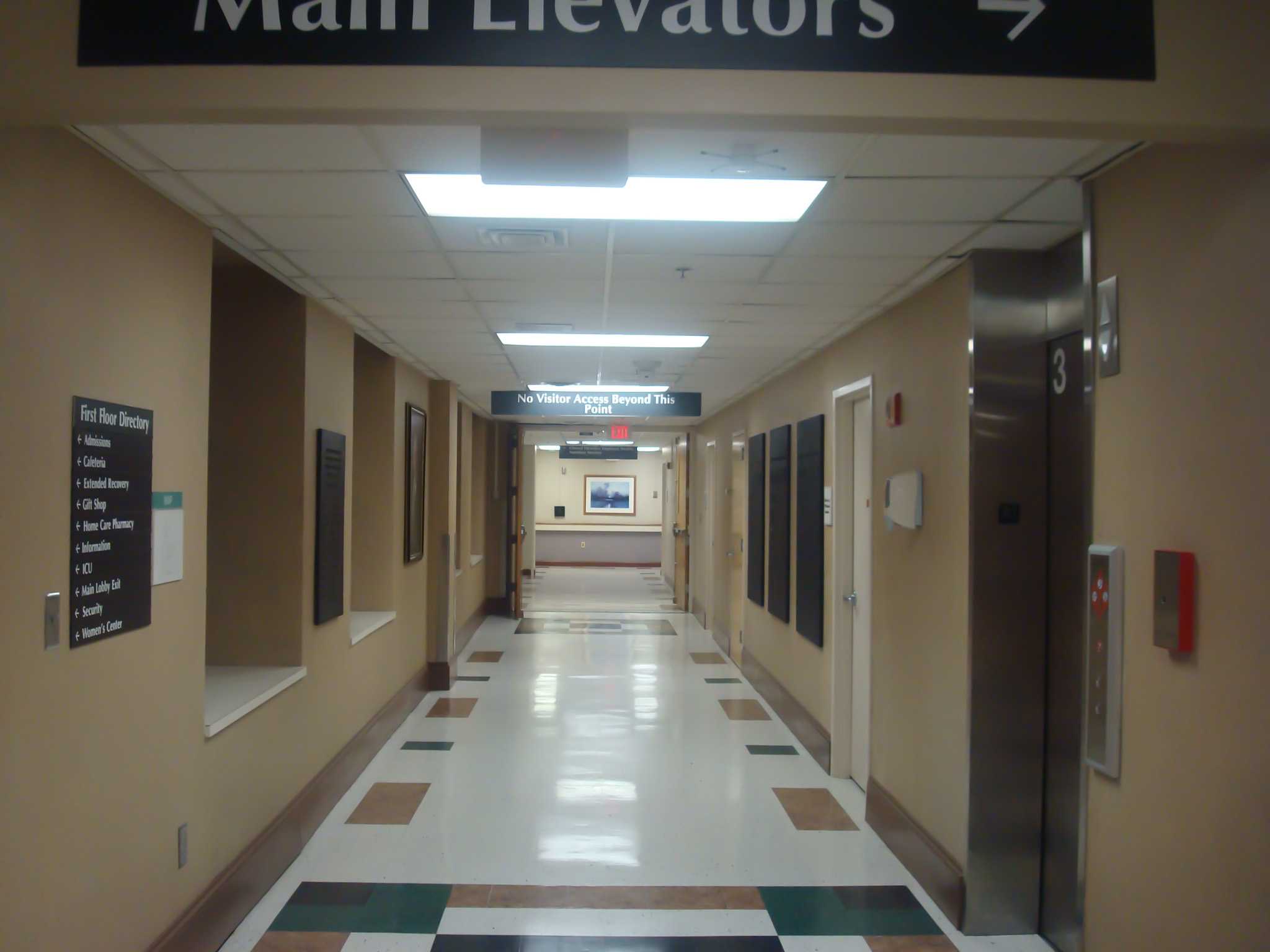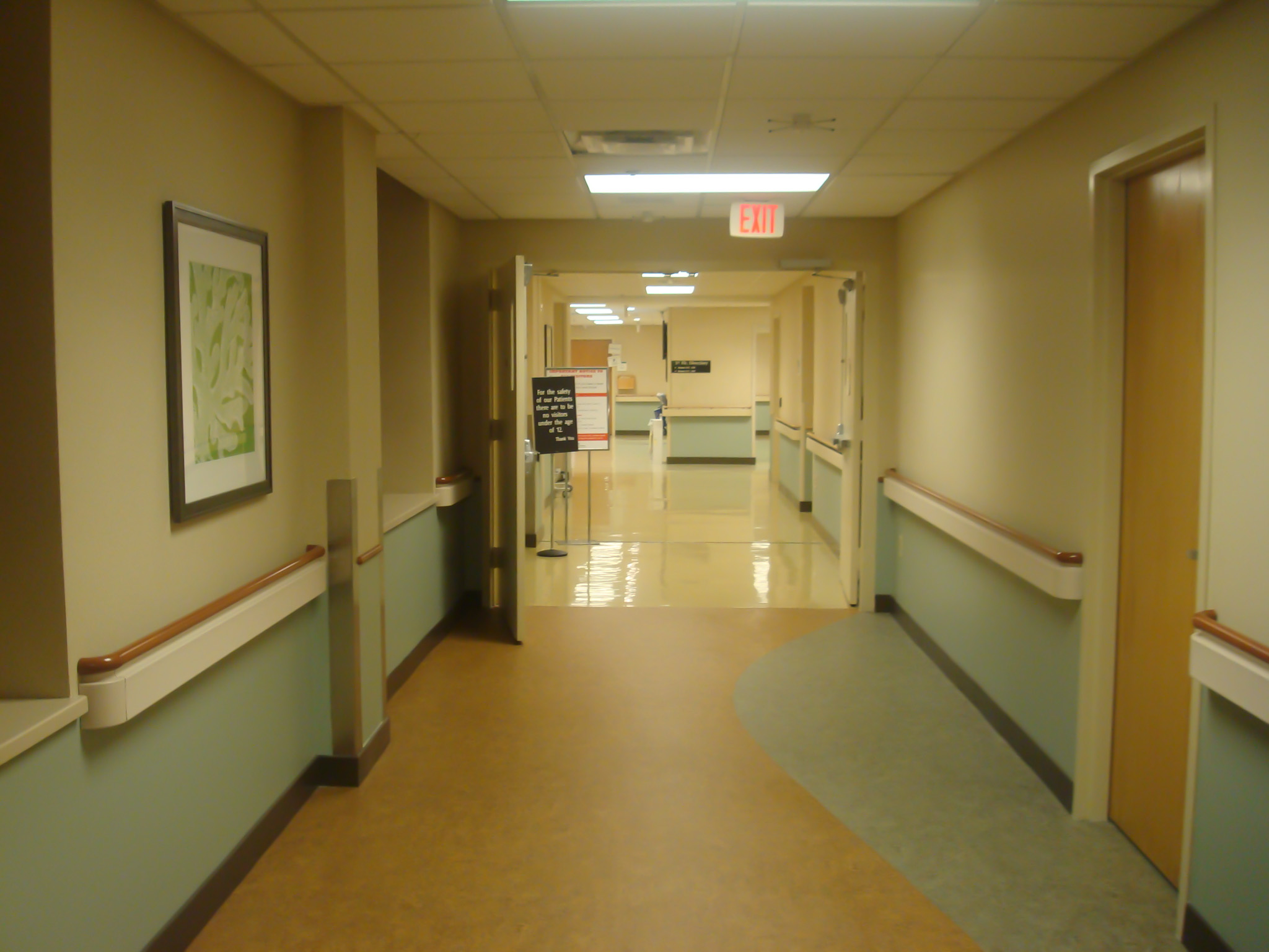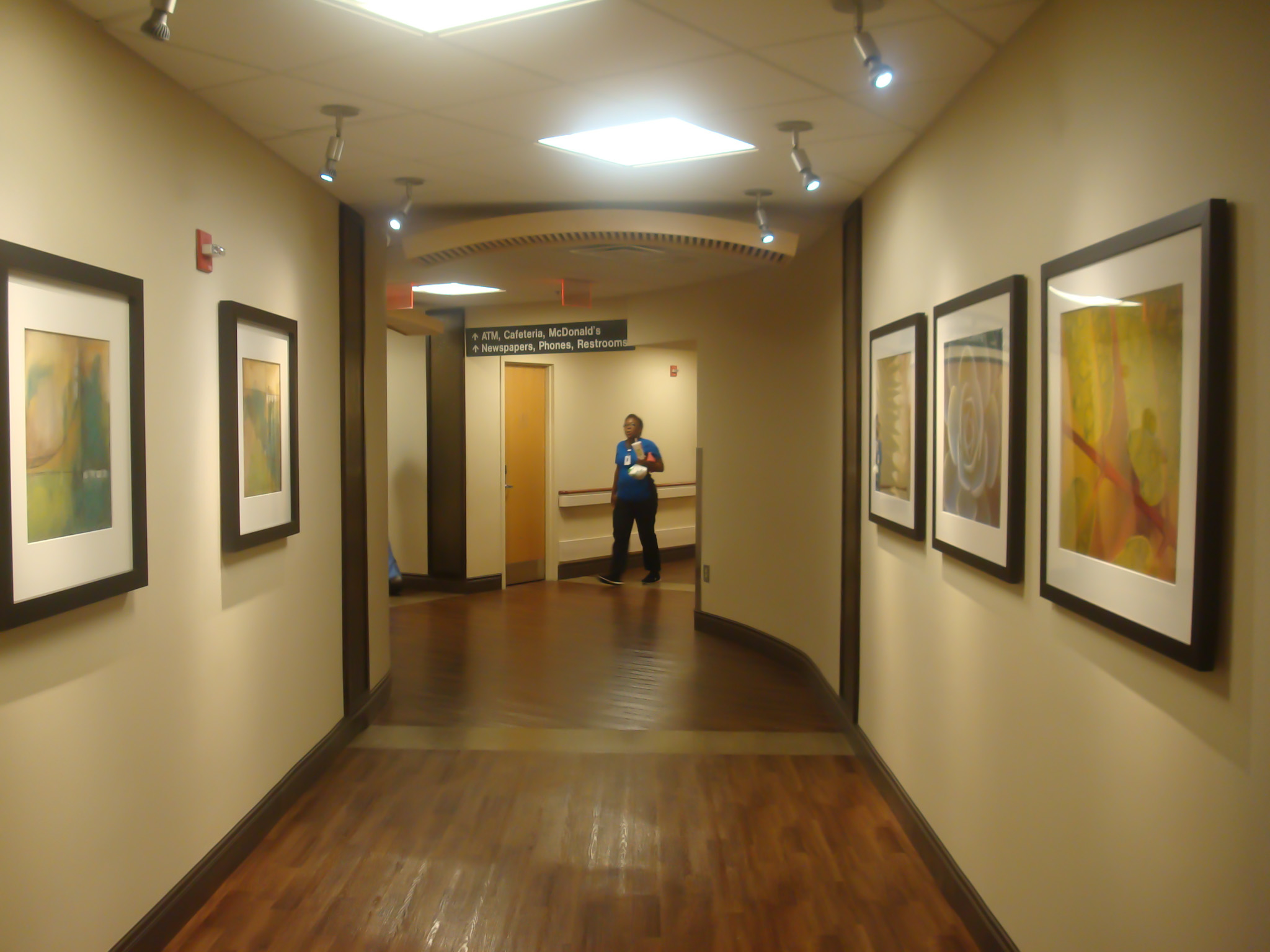
Here is how you get from the main parking lot of Northside Hospital — one of the largest in metropolitan Atlanta, with more than 600 beds — to a patient’s room on the third floor.
First, make sure you are going to the right third floor: certain patients are in the separate Women’s Center, and getting there requires changing parking lots or navigating a series of windowless corridors. Assuming you want the main building, walk up the hill, past the beds of pansies and the turn for the emergency room, into the main entrance. You see two separate desks. One is staffed by an administrator and one by a volunteer in a blue coat. Hopefully you do not need further help, as it is not at all clear which questions should be directed to the administrator and which to the volunteer.
Walk past both desks and the gift shop. It seems like you’re supposed to keep heading into the carpeted area, but don’t: that’s patient admissions. Instead turn right and follow the corridor, but do not take the rightward branch toward the ATM and the cafeteria. Eventually you enter a large, open hallway. The elevators to the third floor are on the right, but the sign that says Patient Elevators is centered above your head and is also a muted off-white font on a dark background. It’s easy to miss.
If you keep walking, you end up beneath a No Visitor Access Beyond This Point sign, also easy to miss, as there’s otherwise no change in the hallway layout. Probably then an overworked employee will stop you and guide you back to the elevator.
On the third floor, turn right for Patient Rooms 301 through 331 and left for Patient Rooms 332 through 369. You can look for a sign, but if you’re unlucky you exit the elevator that opens in front of a window. The nurses’ station should then be able to direct you, finally, to the room you need.1
What you’ve been doing, or rather having some trouble doing, is interpreting visual cues to figure out where you are and where you need to go next. This is called wayfinding. Most people navigate such mazes every day without much conscious thought until they try to negotiate a perplexing, unfamiliar place while under stress and time pressure. Until they are, say, in a hospital.
One foot in front of the other
The term “way-finding” was coined by urban planner Kevin Lynch in his 1960 book Images of the City. Lynch had Boston residents draw maps from memory of areas of the city they knew well. Based on their drawings, he described how people used particular landmarks as navigation tools. Since then a body of research has grown up around not just understanding how people find their way, but designing better wayfinding systems for them to use.
Architects, planners, and graphic designers think of wayfinding in terms of five major elements: the paths people can take to traverse a space; the markers they see along the way; the nodes, where they have to make decisions about which way to go; the edges of the space; and the different “zones” of a space, where different functions happen. (Think of your bedroom as one zone, the hallway as another, and the bathroom as a third.) A well-designed wayfinding system allows people to move between zones easily, know when they leave one zone and enter another, recognize the markers, and choose the correct next move at each node without too much trouble.
Within a building, the most frequent wayfinding aids offered are signs and printed maps. But users of the building will take their wayfinding cues from all the visual information available, even the colors of the walls and floor.2 The larger, busier, and more complex a building is, the harder it’s going to be to navigate, signs or no. A 1991 study compared a simple building layout with no signs, and a more complex building layout with many signs, and found that people in the latter made more wrong turns.
To better understand how wayfinding cues affect behavior, imagine yourself at Ikea, a store with a particularly, shall we say, insistent wayfinding system. Upon entrance at the outlet I frequent, you are directed immediately to the showroom floor, and from there every possible cue directs you past all the modernist layouts, wooden pencil dispensers, and screwed-together desks possible before you can get back to the first floor. Then the process repeats itself before you can finally stumble to the cash registers. The path is set, the nodes (shortcuts) well-hidden, and the markers easy to lose in the visual jumble.3
“Ikea is highly disorienting,” commented Alan Penn, a dean at University College London, in a talk on how people behave in the store. “You can only give in and follow the route that they set out for you, because to do anything else is really difficult.”
Wayfinding cues turn out to be everywhere. Cities enhance touristy areas with signs pointing to popular destinations and kiosks featuring easy-to-read maps. Supermarkets position displays so that you can’t cut directly from the entrance to the cash register. Museums place discreet arrows to guide you from one room of the collection to the next. At Dealey Plaza, where John F. Kennedy was shot in 1963, a museum devoted to the assassination shifts the background color of the main exhibit from white to dark gray when the subject turns to the moment of the assassination, while a carefully placed panel keeps viewers from gawking immediately at the window used by Lee Harvey Oswald.
Companies can turn to a variety of design consulting firms for help. The Society for Experiential Graphic Design (SEGD) includes in its annual awards prizes for the best wayfinding systems, based on not just signs and maps but zones with their own visual identities and the inclusion of memorable landmarks. There is even a subset of consultants who specialize in environmental design for health care. Health care could use it.

Walk into the light
Hospitals offer a particularly daunting set of wayfinding challenges. First, they have to serve multiple audiences: doctors, nurses, and other staff; patients; visitors; volunteers; and first responders. Those who need the emergency room need a different entrance than non-emergency patients, while some patients need to be quarantined and some areas are restricted to staff. Some visitors will have more trouble reading signs: certain medications make people more sensitive to light, so they’ll have more trouble seeing signs near lamps and windows. Patients with dementia will have a harder time making a mental map of the area.
And, of course, almost everyone visiting a hospital is under stress. As Steve Stamper, whose Austin-based environmental design firm fd2s serves many health-care clients, puts it, “There are very few instances where people want to go to hospitals.”
The different audiences even use different words to describe what’s in the hospital. A common problem is when the medically literate staff members use technical terms or abbreviations to refer to locations, while the patient doesn’t know whether she needs to go to x-ray, radiology, or imaging. In 2010, SEGD and the Robert Wood Johnson Foundation, which devotes research funding to health issues, published a set of 54 graphics meant to function as universal wordless symbols for such common departments as cardiology, surgery, and infectious disease. But adoption so far has been limited.
The older the hospital is, the more difficult it can be to navigate, says Ellen Taylor, director of research for the Center for Health Design. The introduction of new equipment into operating rooms means the rooms have gotten larger over time. If a hospital adds a new building, the floor-to-ceiling heights may be different from those in the old building, limiting the ability to build walkways between the two. Departments also move around frequently, even changing spaces from day to day, depending on shifts in technology and patient need.
All this would be headache enough for the one person tasked with maintaining a coherent wayfinding system. But that one person often doesn’t exist. Responsibility for the elements of wayfinding might be divided among four or more different departments: facilities management, for the signs; marketing, for printed maps; IT, for directions included on the hospital Web site; and hospitality services, which trains the volunteers who are frequently asked for directions.
I was unable to speak with someone from Northside Hospital for this article, despite several attempts, in part because my contact in media relations couldn’t figure out who should handle my inquiry. Curtis Roberts, Stamper’s partner at fd2s, says that they frequently tell health-care clients to create a full-time job devoted to wayfinding management.

15,000 signs and counting
Poor wayfinding systems can be expensive. A 1990 study estimated that the amount of time staff at a regional hospital spent giving directions over the course of a year added up to 4,500 hours.4 A confusing wayfinding system can also increase the time that needs to be spent on training new staff, and lead to costs in terms of delayed or missed appointments. Finally, when patients and visitors feel lost and confused at the hospital, they are likely to mention it on surveys later.
But Taylor says hospitals usually don’t try to address wayfinding issues until staff members begin complaining about being asked for directions all the time. An interior redesign or move into a new facility can also prompt a new focus on wayfinding, which can be no small thing: when Children’s Hospital of Boston overhauled its wayfinding system in 2003, some 15,000 new signs were installed.
As hospitals get bigger and more competitive with each other, a new visual design and wayfinding overhaul can be seen as a way to distinguish the brand. Children’s hospitals have been freer to experiment with whimsical approaches to wayfinding. At Randall Children’s Hospital in Portland, Oregon, each floor was assigned a motif based on a different animal (the eighth floor has bears, for example), which repeats all over the floor, including at toddlers’ eye level. Hospitals have also been experimenting with technological aids to help new patients navigate the space, including interactive kiosks that can print customized directions and custom-designed mobile software.
In some cases, hospitals can combine wayfinding prep and advertising. Northside’s labor-and-delivery unit is one of the largest in the country, with more than 14,000 babies born there in 2012. Not surprisingly, the hospital invests extra resources to attract potential parents’ business, including free guided tours of the Women’s Center to familiarize the expectant with the building and minimize confusion on delivery day.5
But there is only so much that can be done to make a complex system easy to navigate. Consider Massachusetts General Hospital’s main campus — all 21 buildings of it. A new map, designed by the firm Two Twelve, distinguishes major corridors by color and 18 separate elevators by letter. (One benefactor’s name muddles the scheme: the Gray Entrance leads to the green corridor.) The hospital apparently considered the map a success, and the fact that it resembles the New York City subway map in complexity is not Two Twelve’s fault.
Thinking about wayfinding highlights the tension between a hospital’s need for growth and the vulnerability of the people who use it. Adding on new specialties, new equipment, and new amenities (and sometimes taking on new corporate identities), the hospital grows, but its patients, visitors, and employees have to navigate it on a human scale. “At lots of hospitals we talk to, the staff is very proud to offer hands-on help,” says Roberts. “They’ll help walk people to wherever they want to go. But…it becomes terribly inefficient.”
Photos by the author.
-
This scenario is only partly hypothetical: I walked this route multiple times when my mother was being cared for on Northside’s third floor in the spring of 2013. It was disorienting enough to see my mother so ill without the additional navigational stress. ↩
-
That’s the problem with Northside’s crucial elevators: since they’re flush against the wall, the only visual cue to turn right is the overhead sign, and there’s no incentive for the user to look up toward the ceiling at that particular point. The effectiveness of the sign depends entirely on the user seeing it as she makes the turn into the corridor, well before reaching the elevator. ↩
-
A recent column by Adam Davidson in the New York Times explained that Ikea had retooled its staffing to provide more hands-on navigation help, but I didn’t see this in a trip to the store just a few days ago. ↩
-
Craig Zimring, “The costs of confusion: monetary and non-monetary costs of the Emory University hospital wayfinding system.” Georgia Institute of Technology paper, 1990. ↩
-
Full disclosure: both my daughters were born at Northside (one in 2009 and one in 2011), and yes, I took the walking tour the week before giving birth to the first one. ↩
Jessica Doyle writes about business education at Economist.com and previously covered the southeastern United States for the Economist. She has a master's in city and regional planning from Georgia Tech, where she was a researcher at the Center for Quality Growth and Regional Development.
